

Powerbrake
Brand Identity & Visual Guidelines
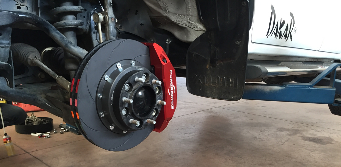
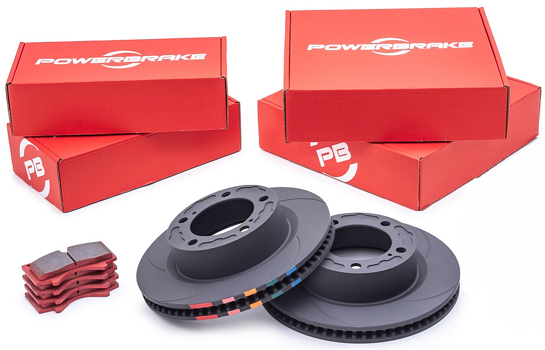
Powerbrake design and manufacture the very best brake upgrade kits on the market for 4x4 vehicles. They export 4x4 brake upgrades to customers in over 25 countries and take pride in their uncompromising build quality and 4x4 brake performance, making them market leaders in this segment.
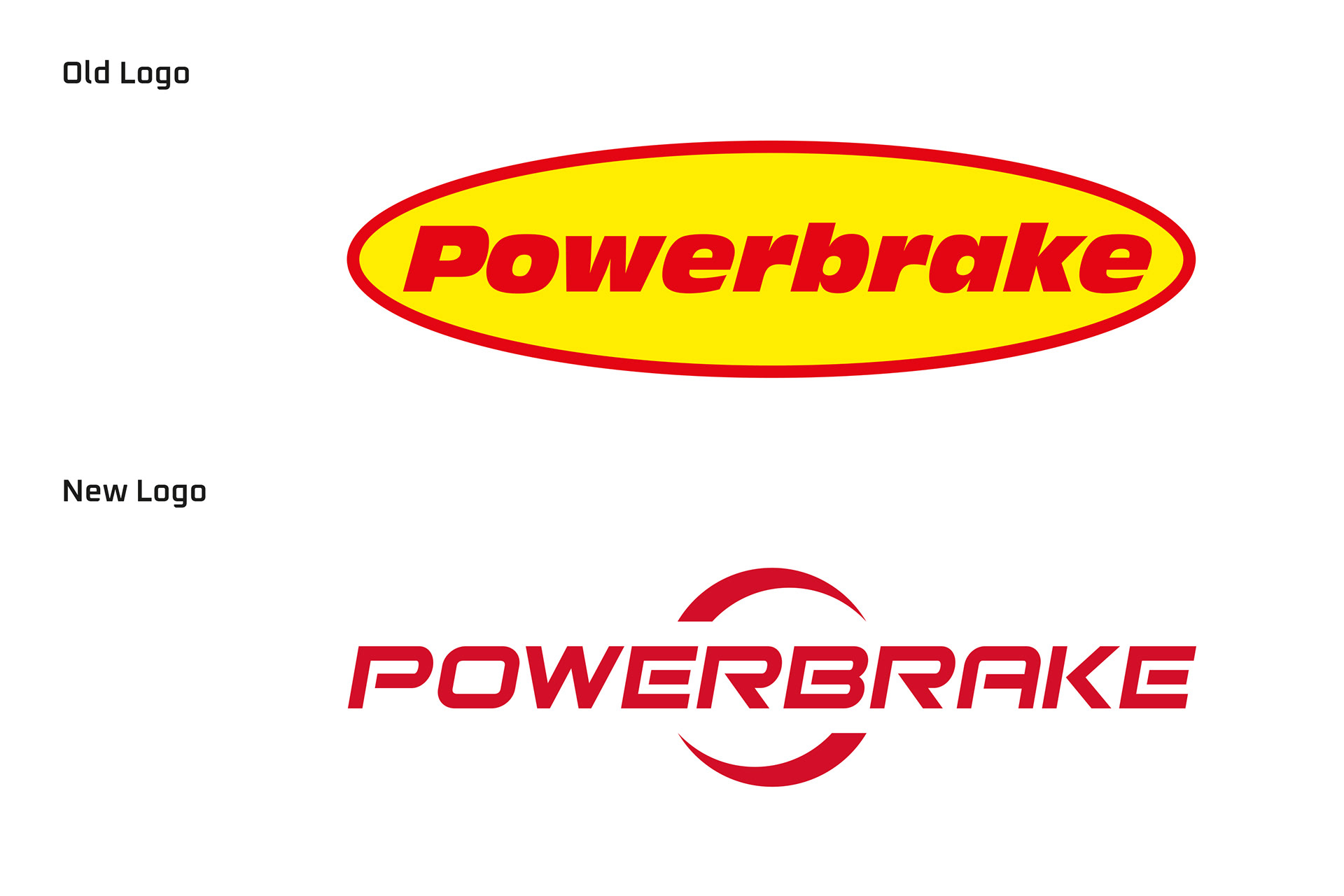
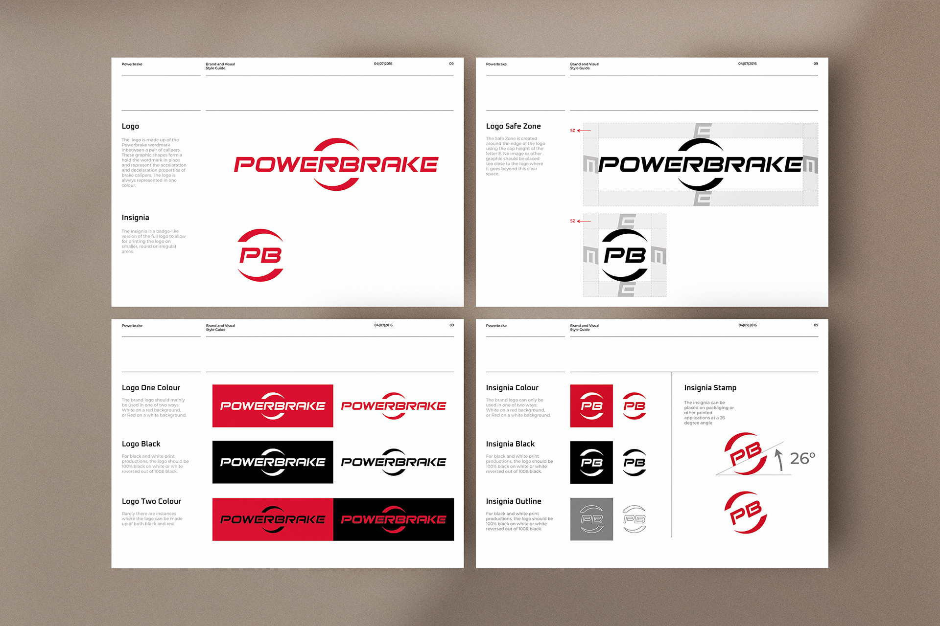
The creative brief was to refresh their brand to better represent their values of precision, power and performance. The logo needed to fit within a wide, narrow space on the brake callipers and therefore a word mark was the best option. The chosen logo concept depicts a modern, square, italicised, upper case font, clamped between two callipers that appear to have a spinning motion.
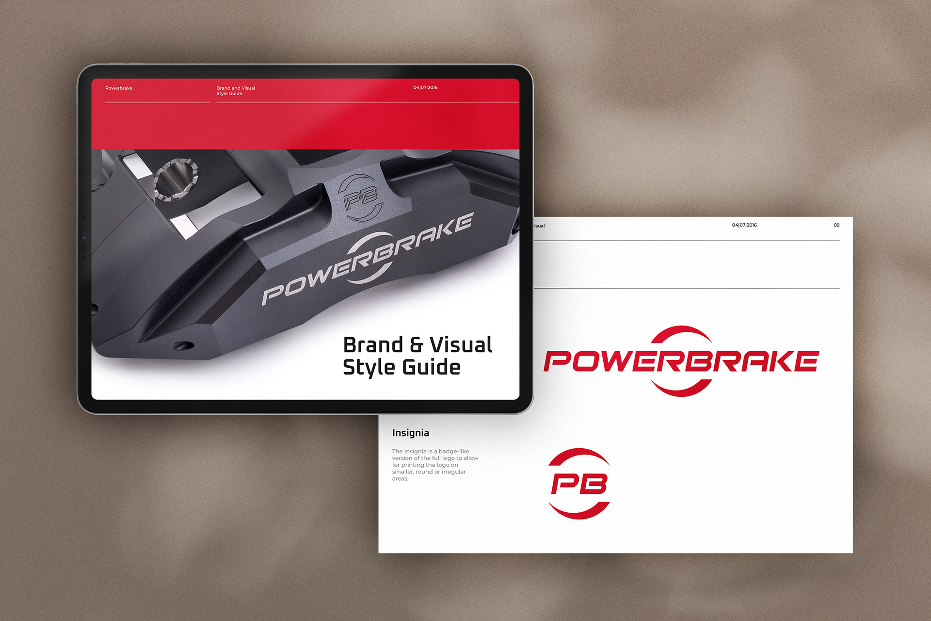
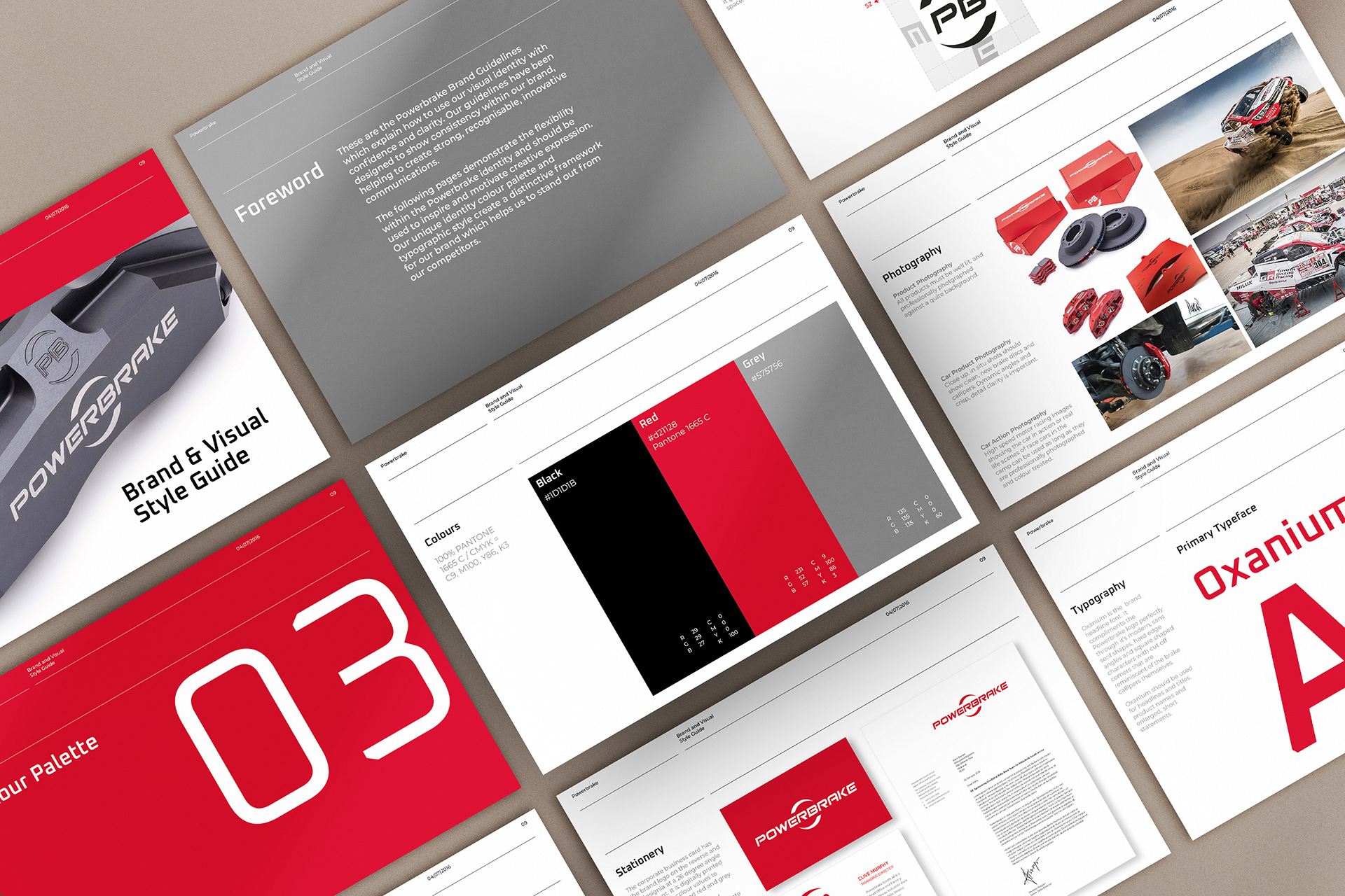
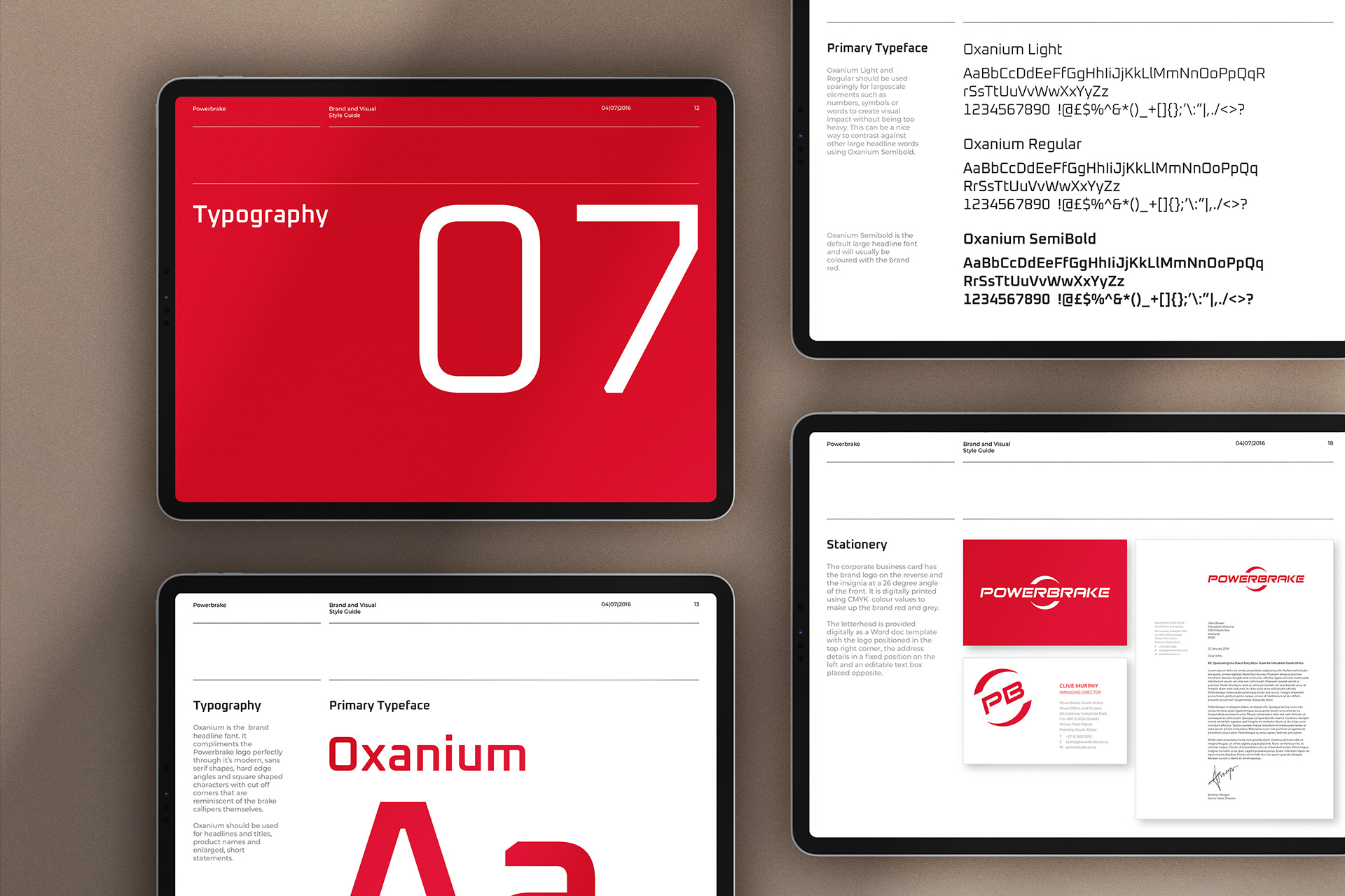
The brand and visual style guide was designed to help to create strong, recognisable, innovative communications and demonstrate the flexibility within the Powerbrake identity to inspire and motivate creative expression.
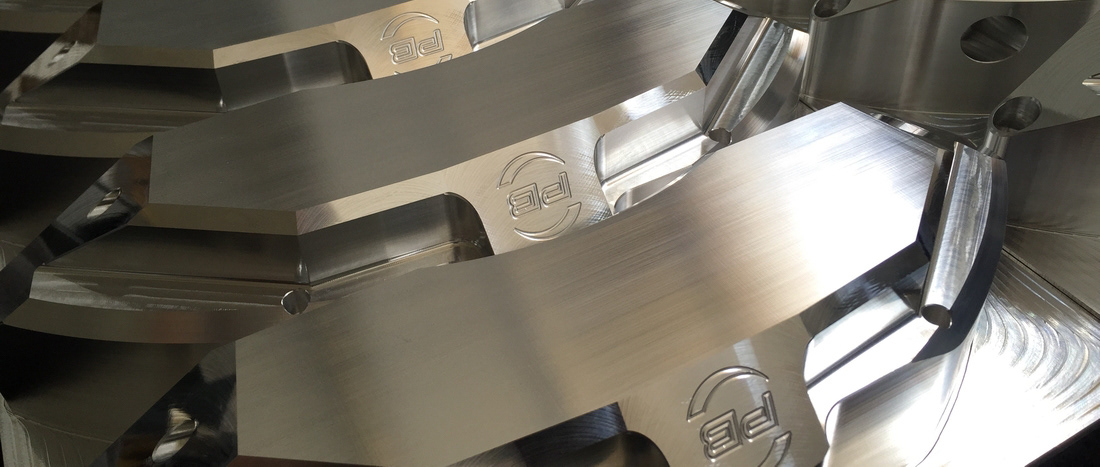
All photography and product images belong to powerbrakeglobal.com